Cards as Visual Statements
Overview
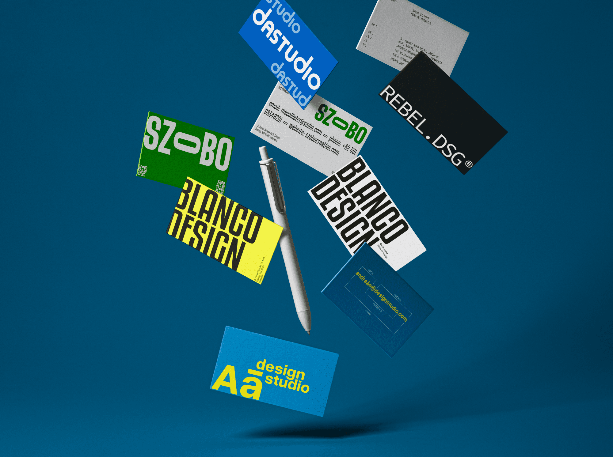
This personal project explores the business card as more than a functional touchpoint treating it as a compact canvas for identity, expression, and experimentation. Through a series of typographic-driven card designs, the project investigates how layout, scale, color, and contrast can transform a traditionally rigid format into a flexible visual statement. Each design reflects a different personality, ranging from bold and expressive to minimal and restrained, while remaining grounded in clear visual hierarchy and usability. Rather than representing a single brand, the project serves as a study of how small-format print design can communicate attitude, tone, and character with precision.
Challenge
The main challenge was pushing creative boundaries within one of the most limited design formats. A business card offers very little space, strict functional requirements, and often predictable expectations. The task was to: - Create visually striking compositions without sacrificing clarity - Balance experimentation with readability - Make each card feel distinct, yet believable as a real-world identity asset - Avoid decorative excess while still delivering strong visual impact The project required restraint as much as boldness knowing when to break rules and when to respect them.
Solution
The solution was to treat typography as the primary design engine. By emphasizing type scale, weight, alignment, and contrast, each card was developed as a micro identity system rather than a standalone graphic. Key approaches included: - Using oversized typography to establish confidence and character - Applying limited but intentional color palettes - Playing with negative space to create tension and balance - Allowing layout decisions to carry meaning, not decoration Each variation explores a different design attitude, proving that even the smallest printed surface can carry a strong conceptual voice.


Result
The result is a curated collection of business card designs that demonstrate versatility, typographic sensitivity, and conceptual thinking. This project showcases how thoughtful design decisions can elevate everyday materials into memorable brand touchpoints. It also highlights an ability to adapt visual language across multiple styles while maintaining consistency in execution and intent. Ultimately, the project reinforces the idea that good identity design doesn’t rely on scale clarity, character, and craft matter more than size.