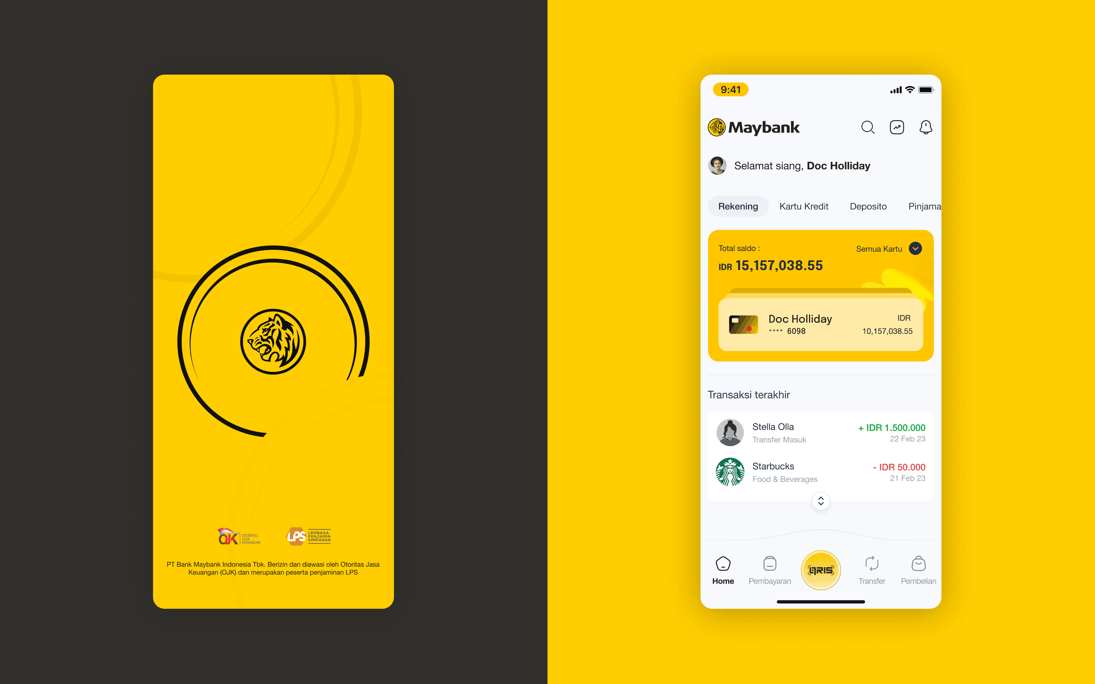
Maybank App

Client
Maybank App
Category
UIX Design
Year
Mobile App - 2023
Overview
This personal UX case study explores how a major banking app can fall behind modern user expectations when core flows become overly complex and outdated. Maybank’s mobile application currently shows signs of legacy UI patterns and inefficient user journeys, particularly in high-frequency features such as QRIS payments. In an era where users expect fast, frictionless transactions, lengthy setup steps and multiple configuration screens create unnecessary friction. This project focuses on redesigning the QRIS payment flow to align with contemporary UX standards, improve speed, and reduce cognitive load while maintaining compliance and security requirements expected from a financial institution.
Challenge
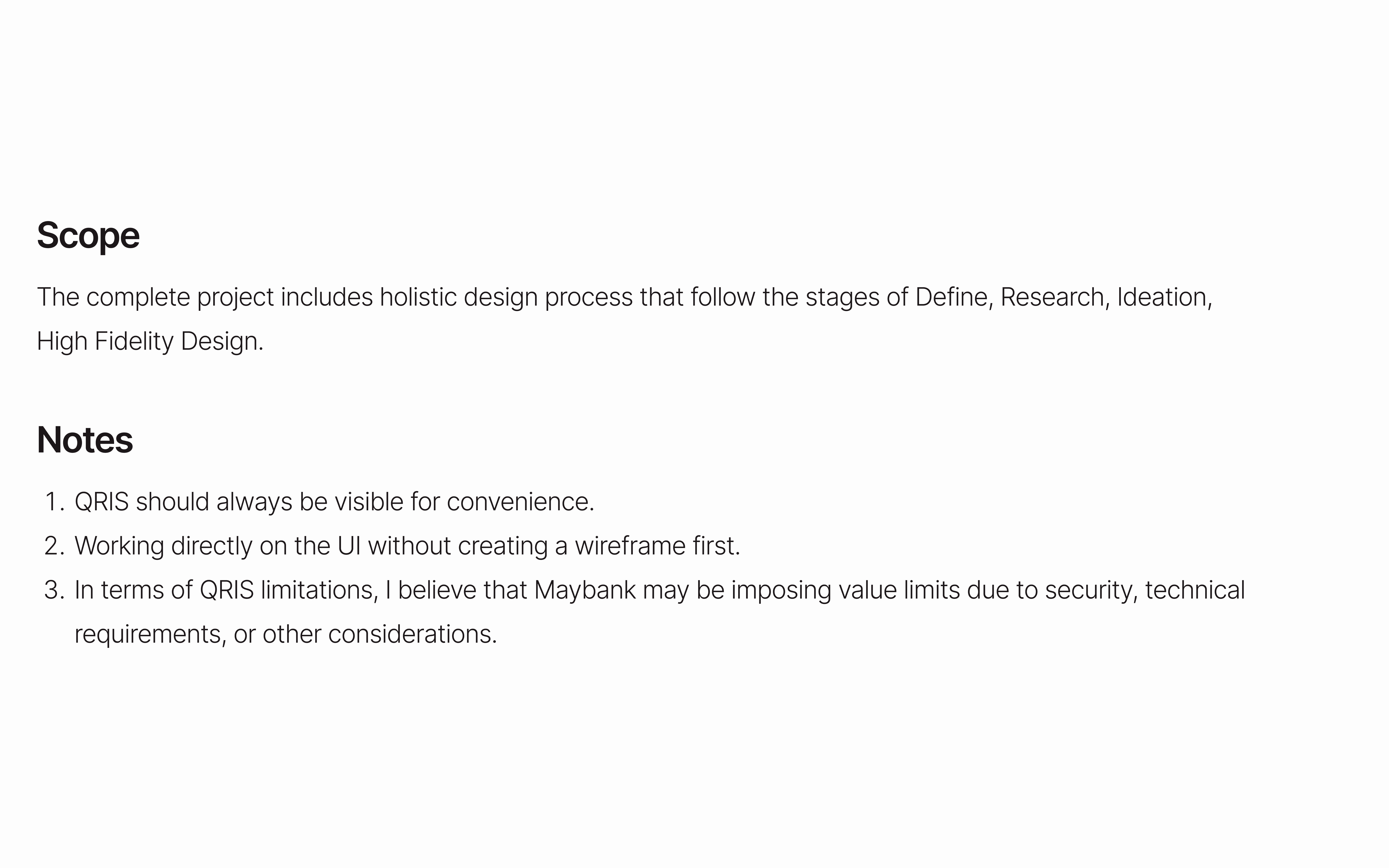
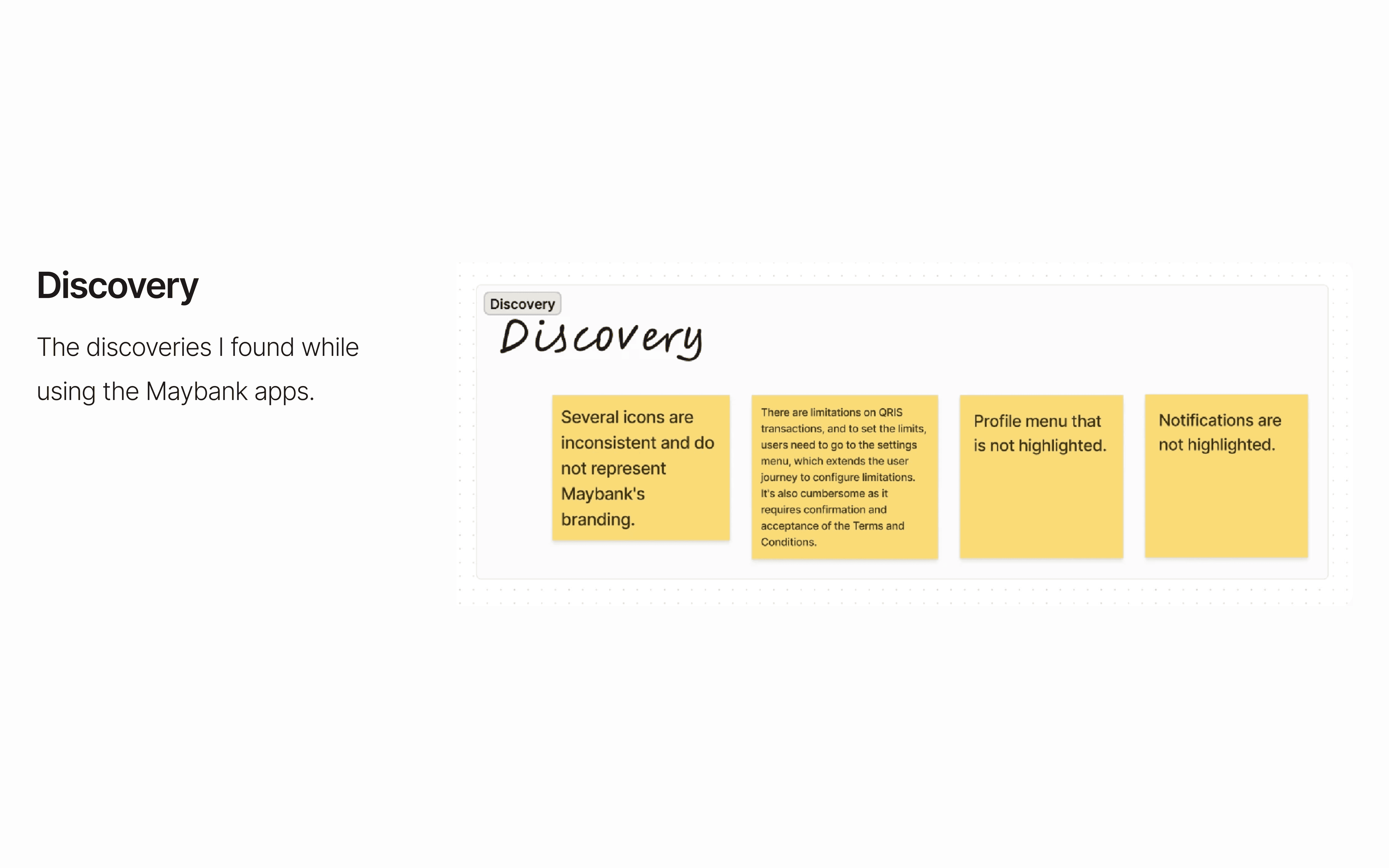
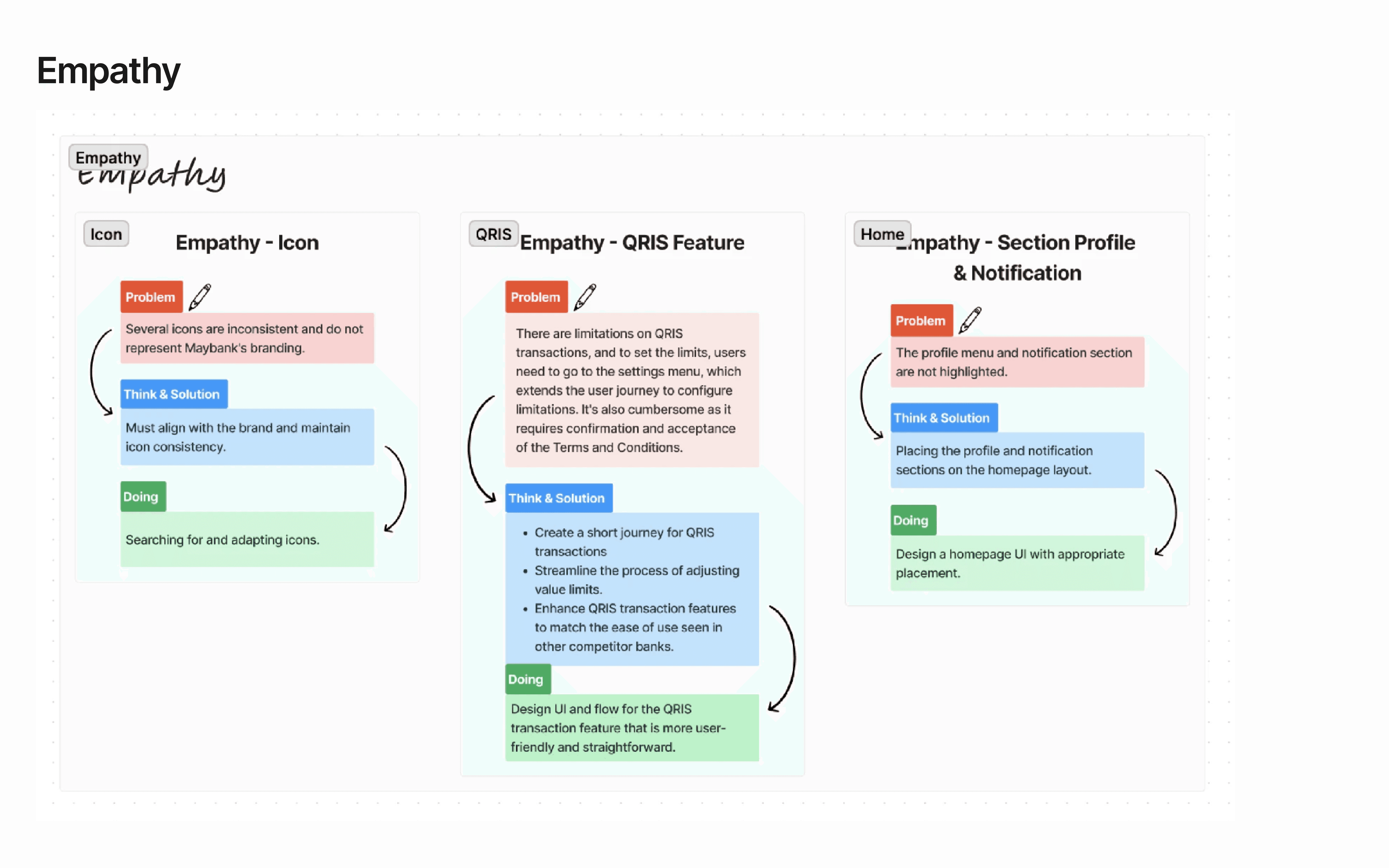
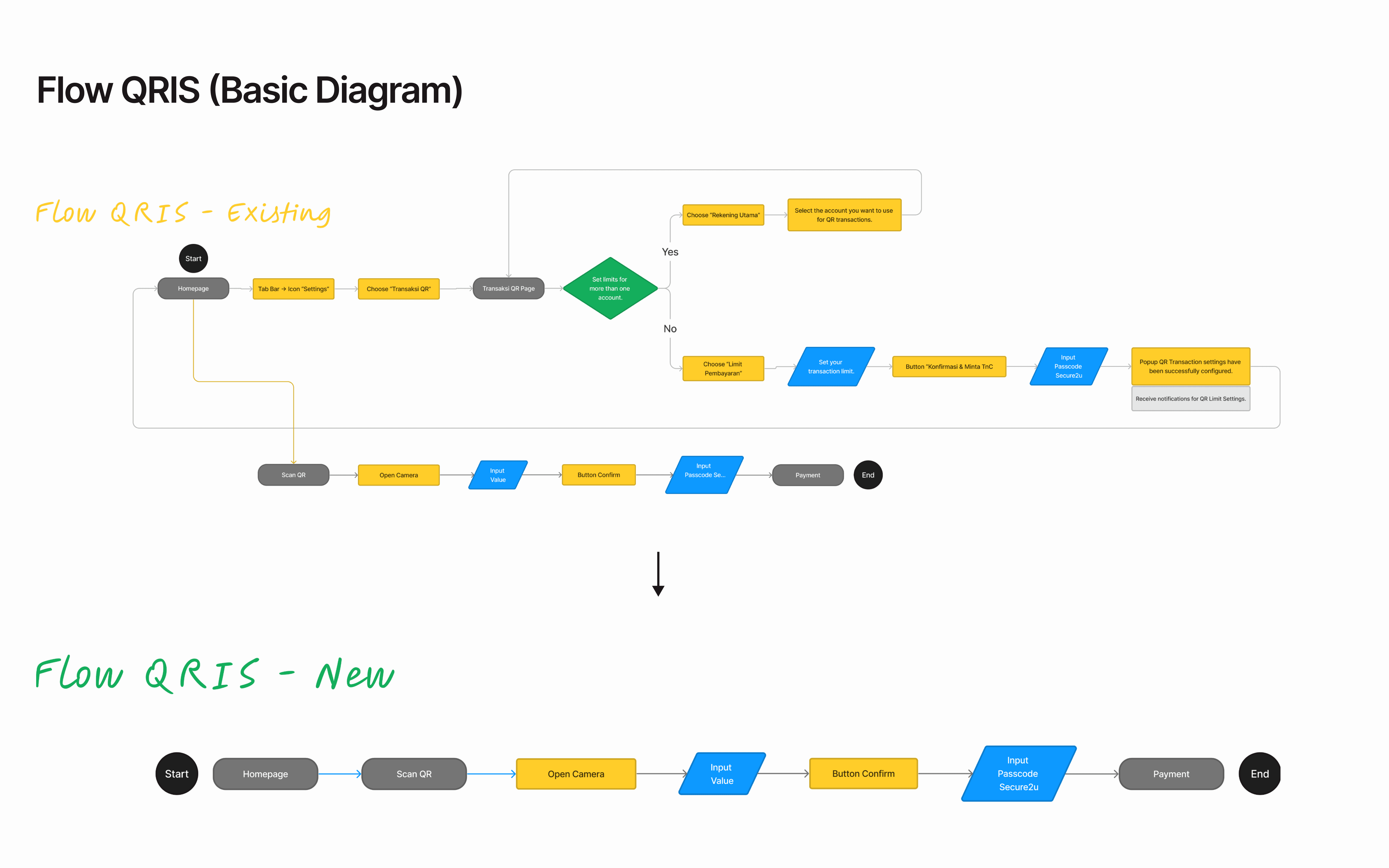
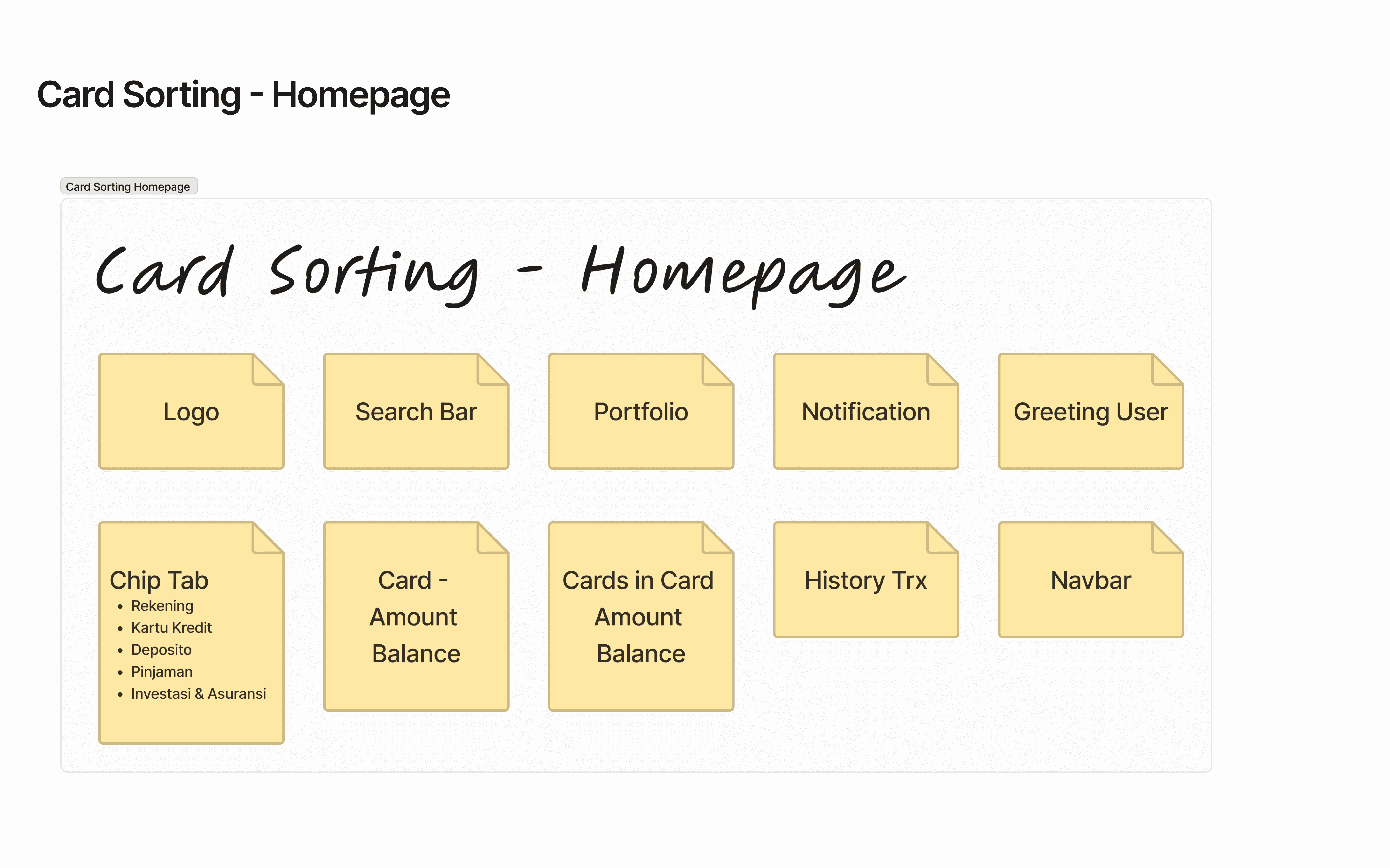
The existing QRIS flow in the Maybank app requires users to go through multiple steps before completing a simple payment. These include: - Repetitive configuration screens - Mandatory limit setup before usage - Long and fragmented user journeys - Lack of contextual guidance Compared to competitor banking apps that offer more streamlined QRIS experiences, this creates a clear usability gap. For a large financial institution, this represents a missed opportunity to meet modern user expectations for fast and intuitive digital payments.
Solution
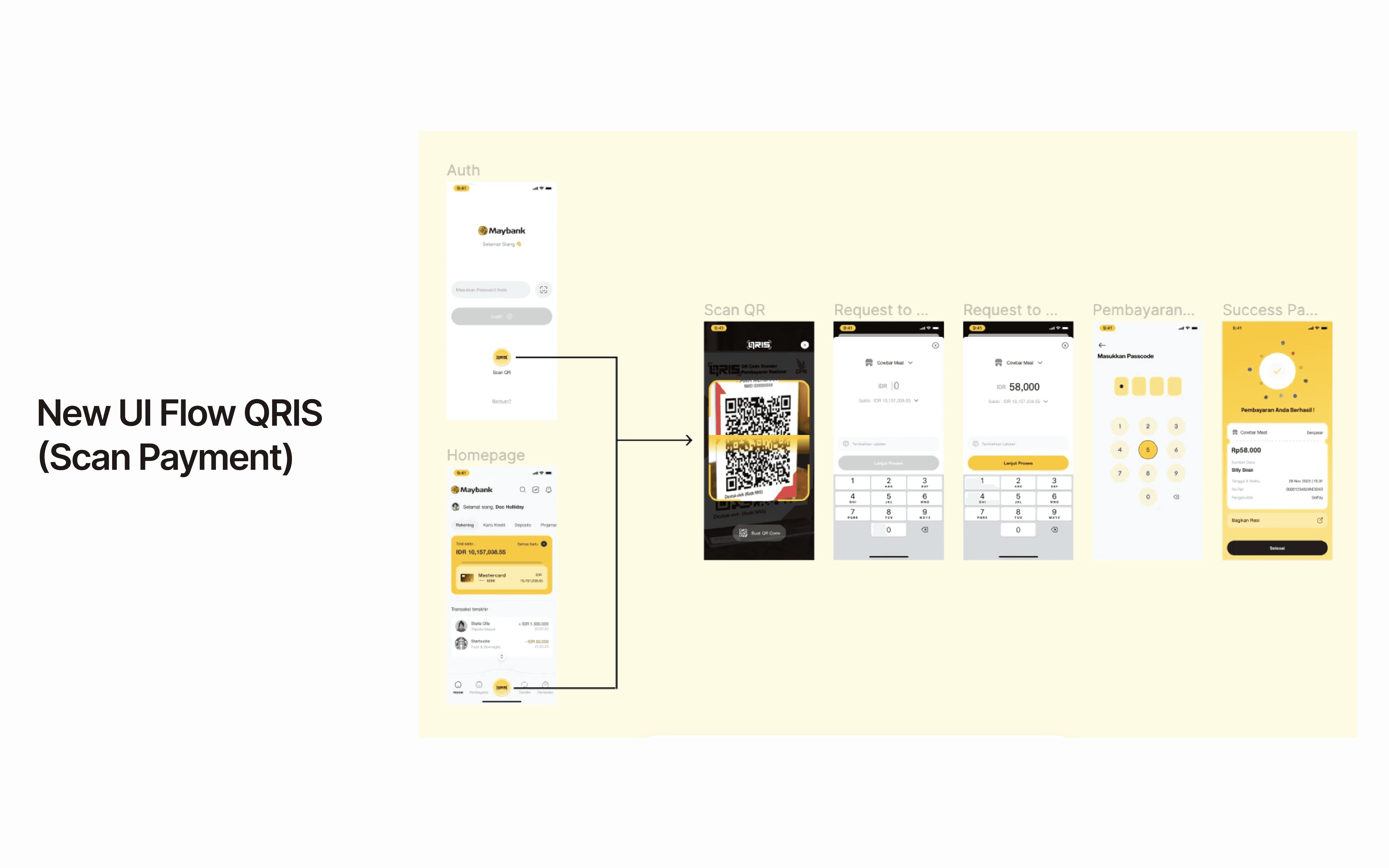
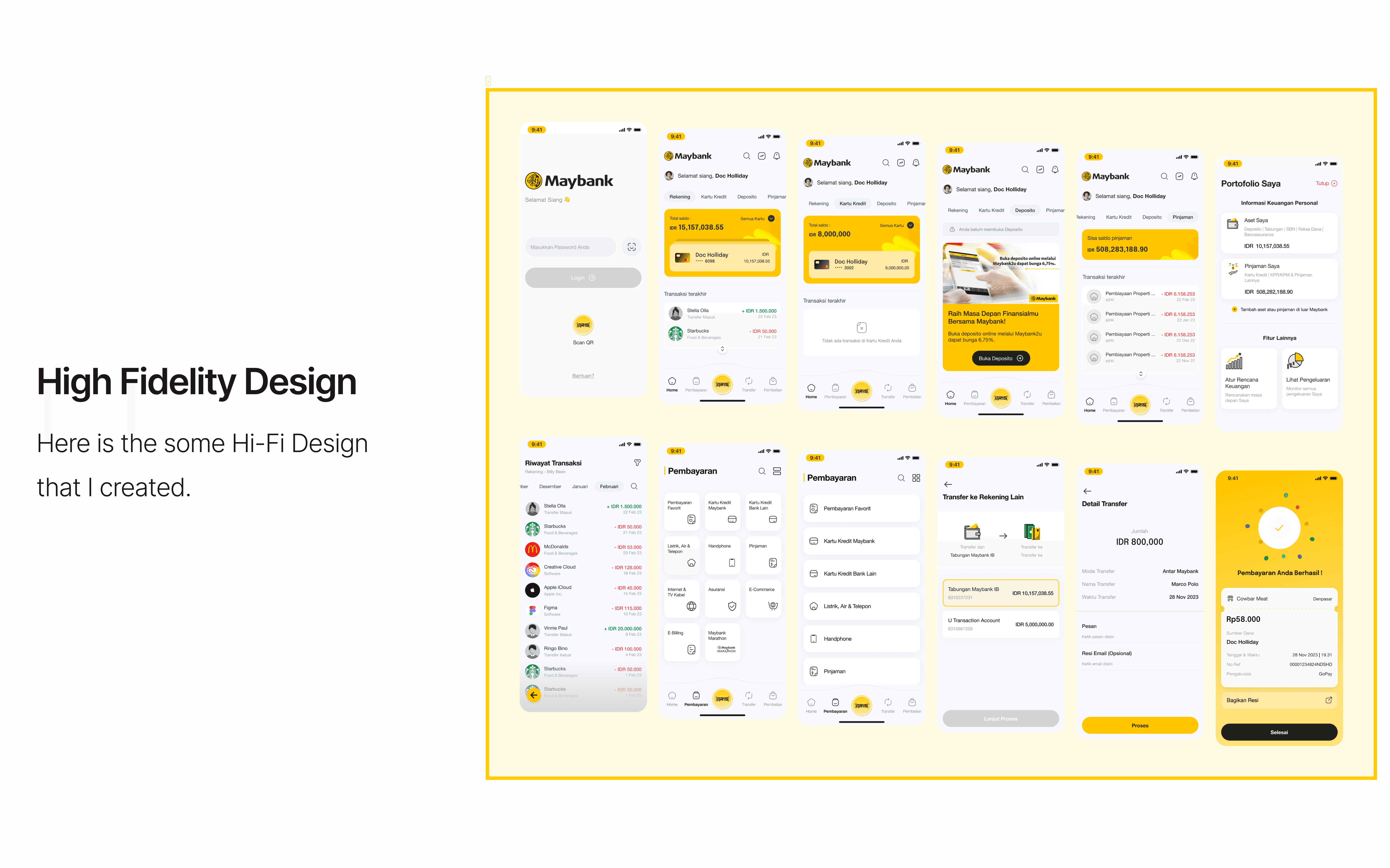
The redesigned QRIS flow focuses on three core principles: 1. Reduce Steps Critical actions are consolidated to minimize unnecessary navigation and setup screens. 2. Contextual Configuration Limit settings and permissions are embedded contextually within the payment flow, instead of forcing users into separate setup processes. 3. Modern UI & Clear Hierarchy Updated visual hierarchy and spacing help users scan faster and understand actions instantly, reducing hesitation and error rates. The result is a more direct, task-focused journey that allows users to complete QRIS payments with fewer interruptions and clearer feedback.

Result
Result The redesigned QRIS experience delivers: - Shorter and more efficient user journeys - Reduced cognitive load during payment - Faster time-to-complete for QRIS transactions - Improved alignment with modern mobile banking UX standards This case study demonstrates how simplifying critical financial flows can significantly improve usability, user satisfaction, and perceived product quality especially for high-frequency features like QRIS payments.
