Typography Posters
Client
Personal
Year
Typography Posters - 2026
Overview
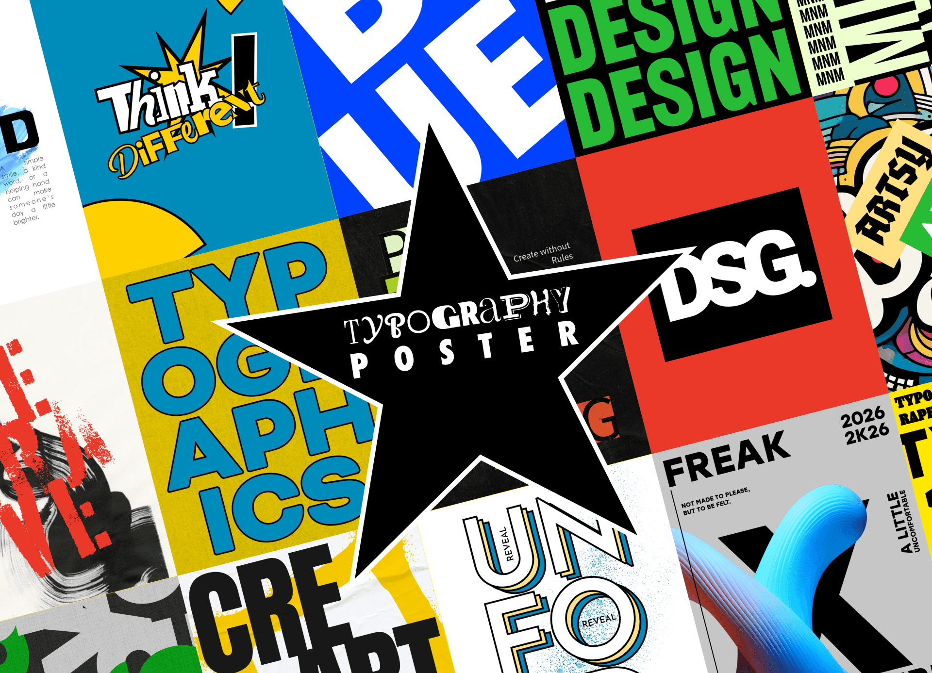
This project is a typographic exploration created entirely using mobile tools, specifically Adobe Express. It challenges the conventional idea that design work requires advanced software and desktop setups, exploring how creativity can adapt within limited environments. The project focuses on experimenting with typography as the main visual element pushing compositions, layouts, and visual rhythm using only what is available on a mobile device. Each piece reflects a different approach, ranging from bold and structured to expressive and experimental. Beyond visual output, this project represents a shift in process embracing flexibility, speed, and creative intuition in a more constrained setup.
Challenge
Designing exclusively on mobile presents clear limitations: restricted control, simplified tools, and less precision compared to desktop software. These constraints can slow down complex executions and limit technical possibilities. Another challenge was maintaining consistency across multiple typographic explorations while allowing each piece to feel distinct. The project needed to avoid becoming repetitive, while still feeling like part of a cohesive series. Balancing creative freedom with technical limitations became a key part of the process.
Solution
The approach focused on leveraging constraints as a creative advantage. Instead of replicating desktop workflows, the process embraced the simplicity of mobile tools to prioritize composition, hierarchy, and bold visual decisions. Typography became the primary driver, with strong emphasis on scale, contrast, and layout. Quick iterations and instinctive decision-making replaced over-refinement, allowing ideas to develop more organically. By working within limitations, the project highlights how design thinking can remain effective regardless of tools focusing on clarity, expression, and visual impact.


Result
The result is a diverse collection of typographic posters that demonstrate flexibility, creative adaptability, and strong visual exploration. Each piece stands as an individual experiment, while collectively forming a cohesive body of work that reflects a consistent design mindset. The project proves that impactful design is not defined by tools, but by the ability to think, adapt, and execute ideas effectively. Ultimately, this exploration reinforces the idea that creativity can happen anywhere across any device, within any limitation. "Design isn’t limited by tools, only by how far you’re willing to explore."